Our customers have been hired at: *Foot Note
Table of Contents
Get started with MyPerfectResume today!
- Build a resume on any device
- Pick an ATS-friendly template
- Tailor with AI copy suggestions
Choosing the best font for your resume can be the difference between standing out to recruiters and being overlooked among a sea of applicants.
Whether you’re a recent graduate or a seasoned professional, this guide will help you make informed resume font choices that can set you on the path to land your dream job faster.
Jump to the best resume fonts to start exploring options for your resume:
What Are the Best Fonts for a Resume?
The best fonts for a resume are clean, easy to read, and professional-looking. The following fonts are widely used, ATS-friendly, and give your resume a polished, modern appearance.
Arial is one of the best sans-serif fonts for a resume. It has a simple design with uniform character widths. It is an excellent font choice for resumes that require a professional and polished look. It works great for fields in technology, marketing, business, and finance.

- Helvetica is a clean, modern, and widely recognized sans-serif font that offers a professional and polished appearance. It is known for its simplicity and readability, making it a popular choice for resumes.
Times New Roman has been around since 1931, first built for newspapers and later transformed into the preferred resume font for candidates in traditional or more conservative industries.
- Verdana is a modern font known for its readability, especially at smaller sizes, and its uniform character widths. It was designed for on-screen use, making it a popular choice for posting your resume online or sharing digital documents.
Trebuchet MS is an excellent font for resumes packed with information. It has a clean and readable design with a slightly condensed and narrow appearance, which can be helpful if you need to fit a lot of information on your resume.
- Georgia was designed specifically for on-screen reading and has a slightly larger x-height, making it more legible on digital displays. It has a classic and elegant appearance with its curved letterforms and moderate stroke contrast.
- Tahoma is a sans-serif font with a modern appearance and a narrower design and tighter spacing between letters than some other sans-serif fonts like Arial or Helvetica. This makes it a great option for fitting more text on a page without sacrificing readability.
- Saira is a versatile font that works well for resumes, especially if you want a modern look that still feels professional. Its distinctive mix of rounded and angular letterforms adds personality without compromising readability.
- Bodoni has long established itself as a professional and sophisticated font type. First designed in 1798, it has a high contrast between thick and thin strokes that can help create a visually appealing and polished look.
- Palatino Linotype’s legibility and readability are excellent, even at smaller font sizes, making it a strong choice for resumes with more content. The balanced mix of thick and thin strokes adds a touch of elegance for a visually appealing layout.


Worst Fonts To Use on a Resume
While the right font can make your resume look clean and professional, the wrong one can make it look cluttered, outdated, or hard to read. Browse fonts to avoid using on your resume below.
Lucida Handwriting
Lucida Handwriting is overly decorative and can be difficult to read, especially at smaller sizes. Its script style may look stylish, but it lacks the clarity and professionalism employers expect in a resume.Edwardian Script
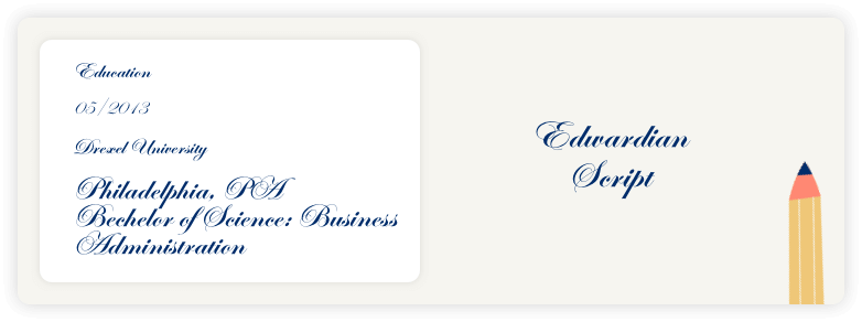
The cursive design of Edwardian Script sacrifices readability for style. While it may look formal, the intricate letterforms can be hard to read quickly and may come across as unprofessional or overly stylized in a resume setting.Vladimir Script
Vladimir Script isn’t suitable for resumes due to its ornate, handwritten style that can be difficult to read at a glance. Its decorative appearance might seem creative, but it lacks the clarity and professionalism needed for a strong first impression with employers.Comic Sans
The casual, playful style of Comic Sans is not suitable for resumes and can make your application seem unprofessional. While it’s easy to read, it doesn’t convey the seriousness or polish that hiring managers expect in a job search document.Papyrus
Papyrus is not recommended for resumes because its artistic lettering can look unpolished and out of place in a professional setting. Its unique appearance may distract from your qualifications and make your resume seem less serious.Courier
The typewriter-style design for Courier looks outdated and takes up more space due to its monospaced format. This can make your resume appear cluttered and harder to read, while also lacking the modern, polished look employers expect.


How To Pick the Best Font for Your Resume
With so many font options available, it can be challenging to choose the right one. Below, we’ll discuss some key factors to consider when selecting the best font for your resume.
Go for an easy-to-read font
Hiring managers often spend just a few seconds scanning each resume, so readability is key. Choose a font with clear letterforms, consistent spacing, and good contrast on both digital and printed formats.
Fonts like Calibri, Arial, and Georgia are great examples—they’re clean, simple, and make your content easy to follow at a glance.
Avoid fonts that are overly stylized or cramped, as they can strain the reader’s eyes and make important information harder to spot.
Find a resume font that conveys professionalism
A polished font choice conveys a sense of professionalism and attention to detail. It shows you put effort into presenting your information clearly and professionally, which can make a positive impression on potential employers.
While it might be tempting to choose a unique or artistic font to help your resume stand out, overly decorative or informal fonts can backfire. They often distract from your content, reduce readability, and may even look unprofessional to hiring managers.
Instead, let your creativity shine through in more subtle and effective ways, such as using a well-organized layout, tasteful color accents, or thoughtfully placed resume icons that enhance rather than overpower your content.
Choose ATS-friendly resume fonts
Many companies use applicant tracking systems (ATS) to scan and sort resumes before a hiring manager ever sees them.
To make an ATS-friendly resume that passes this initial screening, it’s important to use fonts that ATS software can easily read.
Stick with standard system fonts like Calibri, Arial, Times New Roman, or Georgia—these are widely recognized and unlikely to cause formatting issues.
Avoid fonts that are too stylized, uncommon, or embedded as images, since they can cause your resume to be rejected or misread.
Use our ATS Resume Checker to scan your resume and receive instant optimization suggestions to improve your resume score.
Consider the industry and company culture
When writing a resume, it’s important to research the industry and potential employer to adjust your document to their norms. Some industries may prefer more creative or unique fonts, while others expect more traditional choices.
Take cues from the company’s branding, website, or job listing tone to choose a font that aligns with their culture, without sacrificing clarity or professionalism.
A legible and professional font that aligns with industry standards can help your resume appear more relevant and suitable for the desired role. Here are some tips to help you choose the right font based on your industry:
- Creative industries: If you’re in a creative field like graphic design, advertising, or fashion, you have more freedom to experiment with fonts that showcase your personality. Consider using modern, stylish fonts like Saira or Lato to reflect your creative edge. Just be sure your font is still readable and professional.
- Traditional industries: For more formal sectors such as finance, law, or education, it’s best to stick with classic, conservative fonts. Options like Times New Roman, Calibri, or Arial are safe choices that convey professionalism, structure, and reliability. These fonts are well-suited for roles where a polished and traditional appearance is valued.
- Tech industries: In tech fields like software development, IT, or data analysis, clean sans-serif fonts are a great fit. Fonts like Helvetica, Verdana, or Roboto offer a sleek, modern feel that aligns with the forward-thinking nature of the industry. These fonts are also highly readable on screens, which is ideal for digital submissions.
- Healthcare industries: For careers in healthcare, such as nursing, medicine, or medical administration, fonts that project trust and professionalism work best. Serif fonts like Georgia, Cambria, or Palatino Linotype strike a balance between readability and a calm, authoritative tone that’s ideal for this field.
- Writing and publishing industries: In writing-centric fields like journalism, editing, or publishing, readability is key. Serif fonts like Times New Roman or Garamond are ideal because they are easy on the eyes and work well for resumes with more text. These fonts also carry a timeless, literary quality that aligns well with the nature of the work.
Align your font with your personal brand
Your resume font should reflect not just the job you’re applying for, but also who you are as a candidate. Think of it as part of your personal brand—it should support the tone, style, and message you want to convey.
For example, a modern sans-serif font like Lato or Calibri can help communicate that you’re forward-thinking and tech-savvy, while a classic serif font like Garamond can suggest you’re detail-oriented and traditional.
Whatever you choose, make sure it feels authentic to you and consistent with the rest of your resume design, including your layout, color choices, and content style.
Match the font you use in your resume with the font you use in your cover letter. This gives your application a cohesive and polished look. To make a resume and cover letter that match each other, consider using one of our cover letter templates.
Best Font Size for a Resume
The ideal font size for a resume strikes a balance between readability and space efficiency. Follow these standard font sizes to ensure your resume remains legible and professional-looking:
Your name: 18-24 point size
Secondary headings: 14-16 point size
Body text and contact information: 10-12 point size
Font sizes smaller than 10 points can strain the eyes, while larger sizes may make the resume appear cluttered and unprofessional.
Remember to maintain consistency in font size throughout your resume to create a cohesive and visually appealing document.
Print a copy to verify your resume quality and check on different devices, like your phone and tablet, and different operating systems, like Microsoft Windows and macOS.
Resume Font Style and Size Considerations
When choosing your resume font, it’s important to ensure your document looks polished, professional, and easy to read. Explore formatting tips below to get started.
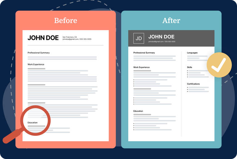
Balance content and white space
A well-balanced resume is visually pleasing and draws the reader’s attention to the important sections and information.
When there is a good balance between font size, spacing, and white space, the resume looks clean, organized, and professional.
Striking the right balance can help you effectively communicate the information hierarchy in your resume, which allows the reader to quickly scan and locate important sections.
For example, using a slightly larger font size for headers helps to distinguish them from the body text and gives them more emphasis.
See what your resume should look like for additional design and formatting tips from Certified Professional Resume Writers (CPRW).
Use fonts consistently
Consistency in font style and size is essential for creating a professional and polished resume. Using too many different fonts, sizes, or formatting styles can make your resume look disorganized and distract from your message.
Stick to one font family throughout your resume, or at most, use one for headings and another for body text—just make sure they complement each other.
Keep font sizes uniform across similar sections; for example, use the same size for all job titles and a consistent, slightly smaller size for bullet points.
This uniformity not only improves readability but also helps create a clean, structured layout that leaves a strong, cohesive impression.
Consider resume length
Determine the resume font size for each section based on the amount of information you want in your resume. You can adjust the font size to fit all of your content onto one or two pages.
For a two-page resume, consider keeping your section headings at a font size of 14 points and body text at 10 points to fit everything within two pages.
If you have less content to include and want to fill out a one-page resume, consider a font size in the larger range.
You can also adjust the spacing between lines and paragraphs to make the most of the space available or test out alternative template options, such as a two-column resume template, which can help you fit additional information on a single page.
Avoid graphics in your resume. Like unreadable fonts, graphics can make it difficult for ATS to read your resume. We recommend using one of our professional resume templates to eliminate the guesswork of designing and formatting your resume.
Best Resume Font Colors
Black print on white paper has long been the standard for resume font colors, and it remains the most common, safe, and acceptable layout. However, black type is not your only option!
Start by considering the industry in which you are seeking employment. Creative fields tend to be more accepting of color on resumes, whereas more conservative jobs may be less tolerant.
Incorporate color to emphasize the content you want to bring to the employer’s attention. See more resume tips for additional ways to make your resume stand out.
Take a look at the professionally crafted examples below to see how color is strategically used for headers and design elements.
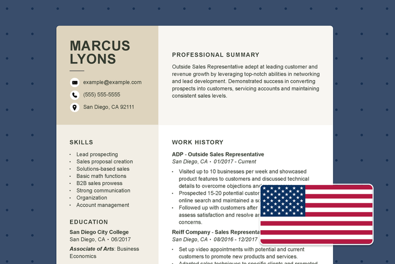
Copywriter

In this copywriter resume, the name and section headings are larger than the body text. The resume font in these sections is also bolded and uses a different font color to stand out.
Patient coordinator

This patient coordinator resume has muted colors and is written mostly in black. The header is the only portion of the resume with some color, but it remains understated.
Store manager

The resume font size and color in this store manager resume example show a perfect balance of professionalism and charisma. By pairing industry-appropriate colors, the candidate comes across as reliable without compromising their personality.
We also have an extensive library of professional resume examples for additional ideas on how to format your resume.
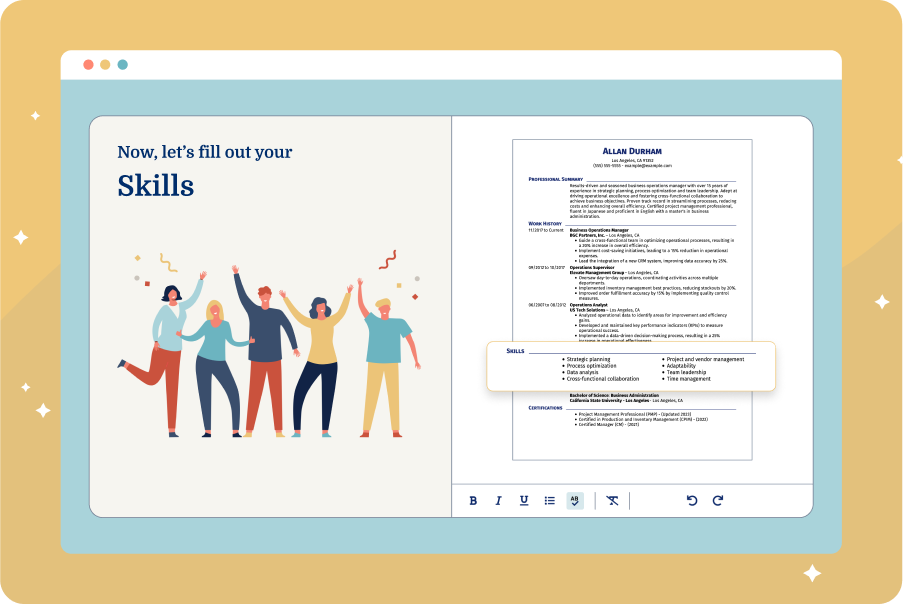
How To Build a Resume With the Best Resume Font
A resume builder simplifies the resume writing and font selection process. Our own AI Resume Builder can help you create a professional document with the best font for a resume.
Answer a few questions about your career to get started. Then, you can play around with different resume fonts, templates, colors, and font sizes.
Our Resume Builder will automatically adjust everything, showing you how the final product will look. Already have a resume? Upload it and refresh it with a new layout and optimized content.
Use these features to create your perfect resume with a professional font and layout:
- Job-specific phrases and skills: We provide ready-made content written by professional resume analysts, tailored to your job title.
- Step-by-step guidance: From the resume summary to the resume work experience section, we give you the advice you need to put your best foot forward.
- Easy customization: Choose between the most popular and recruiter-friendly resume fonts. Switch fonts anytime as you write to see which one fits your style.
- Multiple download formats: You can easily save and download your resume as a PDF, .docx, or plain text from your desktop or mobile device.
Ready to get started? Choose an ATS-friendly template in the best resume format for your career and add your information.
Key Takeaways
- The best resume font is easy to read, professional, and ATS-friendly. A simple, recognizable font for a resume will showcase your qualifications in a professional light.
- Avoid overly stylized, script, or novelty fonts—they can distract from your content and make your resume look unprofessional.
- Stick to 10-12 points for body text and slightly larger sizes for headings to maintain clarity and hierarchy. Use the same font styles and sizes throughout your resume.
- Tailor your font choice to your target industry—more modern for creative or tech fields, more traditional for corporate roles.
FAQ
Why does choosing good resume fonts matter?
Selecting the right font for your resume is an important part of presenting yourself professionally. A clean, well-chosen font enhances readability, creates a polished appearance, and ensures your resume is easy to scan—an essential factor when hiring managers are reviewing multiple applications in a short time.
In addition to visual appeal, the right font supports compatibility with applicant tracking systems (ATS), helping your resume get past automated filters and into the hands of recruiters. Ultimately, a professional font reinforces your credibility and ensures your qualifications are clearly and effectively communicated.
Is it OK to use bold, italics, and underlining in my resume font?
Yes, it’s perfectly acceptable to use bold and italics in your resume, but they should be used strategically and sparingly.
Bold is great for highlighting key information, such as job titles, company names, or section headers, helping important details stand out at a glance. Italics can be used for subtle emphasis, like publication titles, job locations, or dates.
However, avoid underlining, as it can clutter the layout and is often associated with hyperlinks, which may confuse the reader. Instead, rely on bold, italics, spacing, and consistent formatting to organize your resume and guide the reader’s eye through your experience.
Should I use different font sizes on my resume?
Yes, using different font sizes on your resume is recommended to create a clear visual hierarchy and guide the reader through your content. Use these resume font size ranges:
- Your name: 18-24 point size
- Section headings: 14-16 point size
- Body text and contact information: 10-12 point size
Keep your font sizes consistent within each category to maintain a clean and professional appearance. Avoid using too many variations, as that can make your resume look disorganized.
Can I use a nontraditional font on my resume?
It is not recommended to use nontraditional fonts on your resume. While there are no strict rules about which font you must use, choosing a nonstandard or highly stylized font can create problems.
They may not be compatible with applicant tracking systems (ATS) or could display incorrectly on the hiring manager’s device, making your resume hard to read or even unreadable.
Your top priority should be clarity and professionalism. If you want to express creativity, do so through your resume accomplishments, portfolio links, or a thoughtful resume layout, not through unconventional fonts that could hurt your chances.
Can I use a custom or downloadable font for my resume?
It’s best to avoid using custom or downloadable fonts on your resume. While they might look unique on your screen, they may not display correctly on other devices if the font isn’t installed, which can disrupt your layout or make your content unreadable.
Additionally, many applicant tracking systems (ATS) have trouble processing nonstandard fonts, which could prevent your resume from being properly scanned or parsed.
To ensure your resume looks professional and functions correctly across platforms, stick with widely available system fonts like Calibri, Arial, Times New Roman, or Georgia. Save creativity for your content and design, not the font itself.
What is the most professional font for a resume?
The most professional font for a resume is one that is polished, clean, and easy to read. These professional fonts for your resume are widely recognized:
- Arial
- Calibri
- Georgia
- Helvetica
When determining the font for a resume, simplicity and readability are key. Avoid using decorative or unusual fonts, which can be distracting and difficult to read.
Can I use a 10.5-point font size for my resume?
Yes, a 10.5-point font size is perfectly acceptable for a resume, as long as the text remains clear and easy to read. It can be a smart choice if you’re trying to fit your content on one page without making it look cramped.
However, make sure that the font you’re using is legible at that size. Some fonts (like Arial or Calibri) are easier to read at smaller sizes, while others may look too tight or faint.
Always preview your resume on different devices or as a printed copy to ensure readability. If the text looks too small or hard to scan, consider adjusting the font size or trimming less relevant content.

Elizabeth is a Certified Professional Resume Writer (CPRW) and a member of the Professional Association of Resume Writers & Career Coaches. She is committed to helping job seekers navigate the job market and succeed in their careers.
More Articles by Elizabeth Muenzen, CPRWShare this page
Our customers have been hired at:*Foot Note